Brand
Scrynova brand assets
Official logos, symbol, icons, colors and typography. Please follow the usage guidelines to keep the brand consistent.
The mark
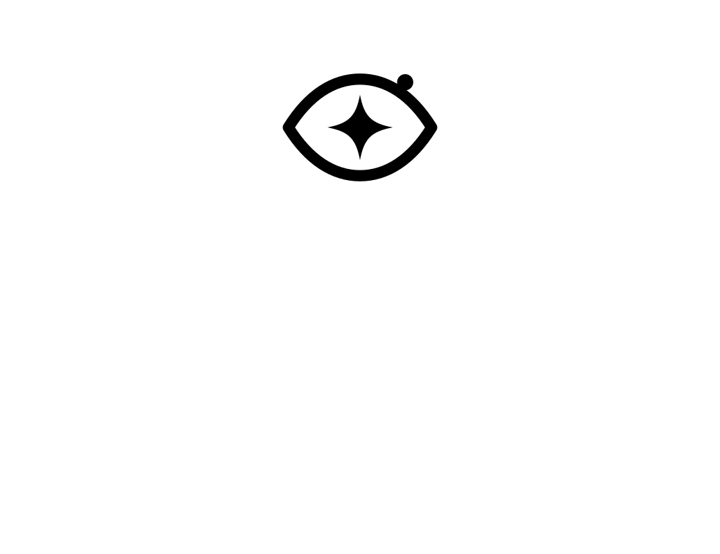
A lens framing a new star.
“Scry” means to see clearly; a “nova” is a bright new star. The Scrynova symbol combines a lens — careful, structured observation — with a four-point star representing a standout candidate. The teal point signals insight.
SCRYNOVASmarter Screening. Better Hiring.
Downloads
Logo files
SVG files are editable vector sources. PNGs are transparent and exported at 2×.












Color
Brand palette
Deep Navy
#0B1F3A · Primary
Professional Blue
#2563EB · Secondary
Teal
#0EA5A0 · Accent
Light Gray
#F5F7FA · Background
White
#FFFFFF · Cards
Success
#16A34A · Status
Warning
#D97706 · Status
Error
#DC2626 · Status
Typography
Two typefaces, one voice.
Plus Jakarta Sans
Display and headings · 600, 700, 800
Inter
Body, interface and data · 400, 500, 600
Usage
Logo guidelines
- Keep clear space around the logo equal to the height of the star.
- Minimum size: symbol 20px; horizontal logo 120px wide.
- Use the dark-background version on navy or dark imagery.
- Use black or white versions for single-color printing.
- Do not recolor, stretch, rotate, outline or add effects to the logo.
- Do not place the full-color logo on busy photographs.
- Write the name as “Scrynova” in text; the wordmark uses capitals.